Announcing bloom daily planners' New Logo!
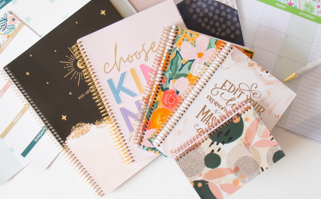
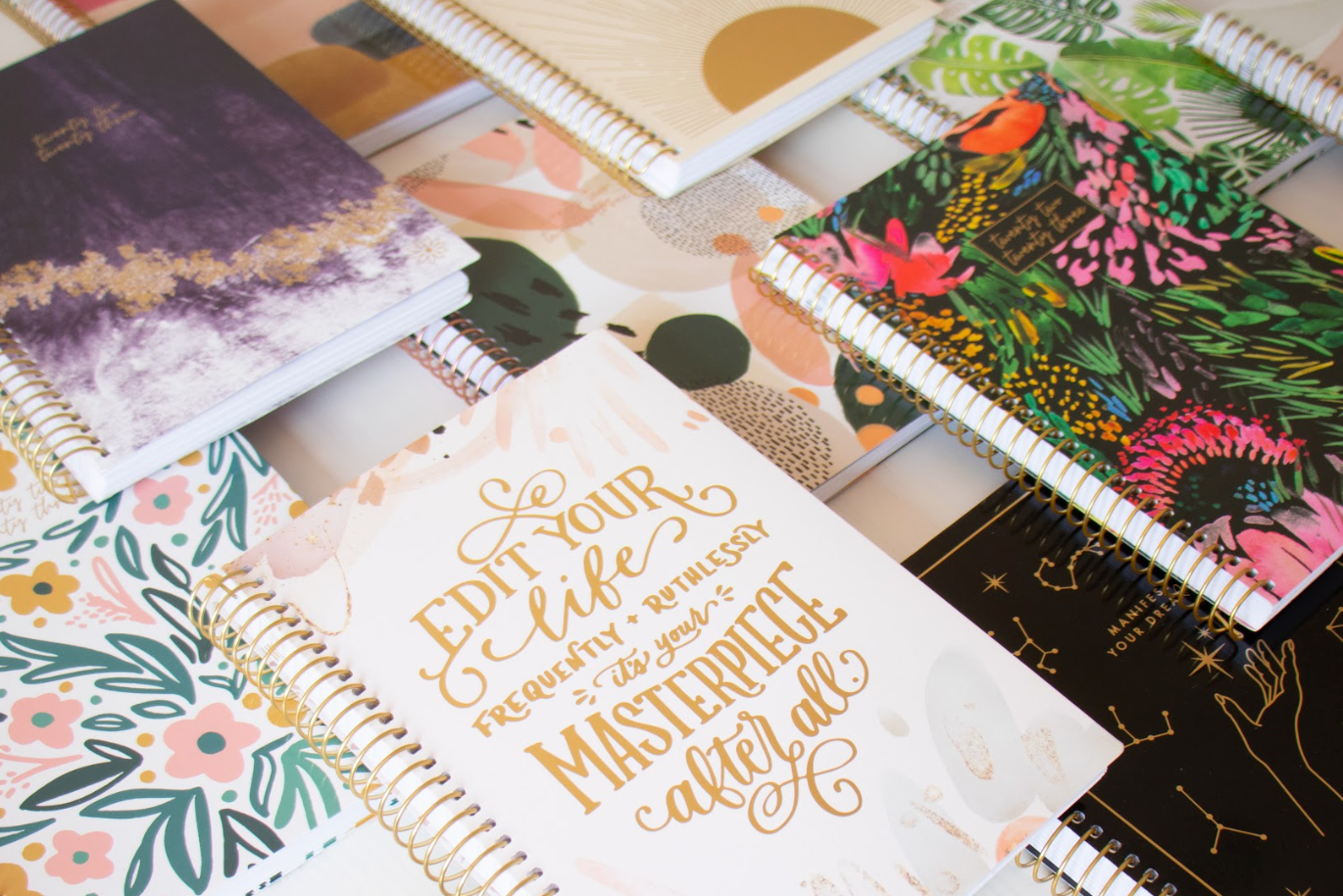
THE EVOLUTION OF BLOOM'S LOOK This is actually our third logo change since we started this wonderful platform 8 years ago! The last change was very slight, and we've all been craving a more dramatic re-design that better reflects all of the crazy (amazing!) growth and changes we've been experiencing these past few years. While changing the logo is a big decision, we feel this new logo truly encompasses the clean, free flowing look we have been evolving into. You will notice that pretty much ALL of of our new products feature hand lettering, so it made sense for us to have the "bloom" part of the logo reflect this smooth hand-lettered look; like something you would actually be writing in your planner! We have also made a major point of "cleaning up" and simplifying our products' interiors to provide a calm, clean slate for you all to plan your most productive days. We've now simplified our products to feature ONLY two fonts: one cursive, hand-lettered font, and one body font. The body text has stayed the same (Raleway, the "DAILY PLANNERS" part of the logo.) One of the most exciting parts of this re-design is that we have actually CREATED OUR OWN FONT for the new cursive, to better match our logo!

This exciting change will allow us to simplify our font choices and make sure all of our products are clean, consistent and true to the bloom brand!
WHY A DAISY?
BEHIND THE SCENES:
We thought it would be fun to share with you all a few different versions we were playing with before deciding on the final logo. While these may look similar to you, but we spent WEEKS analyzing these options, laboring over shapes of "m"s and loops on "o"s! Through LOTS of internal design meetings, LOTS of feedback from friends, family and top customers, we decided together on the final version!




Leave a comment